
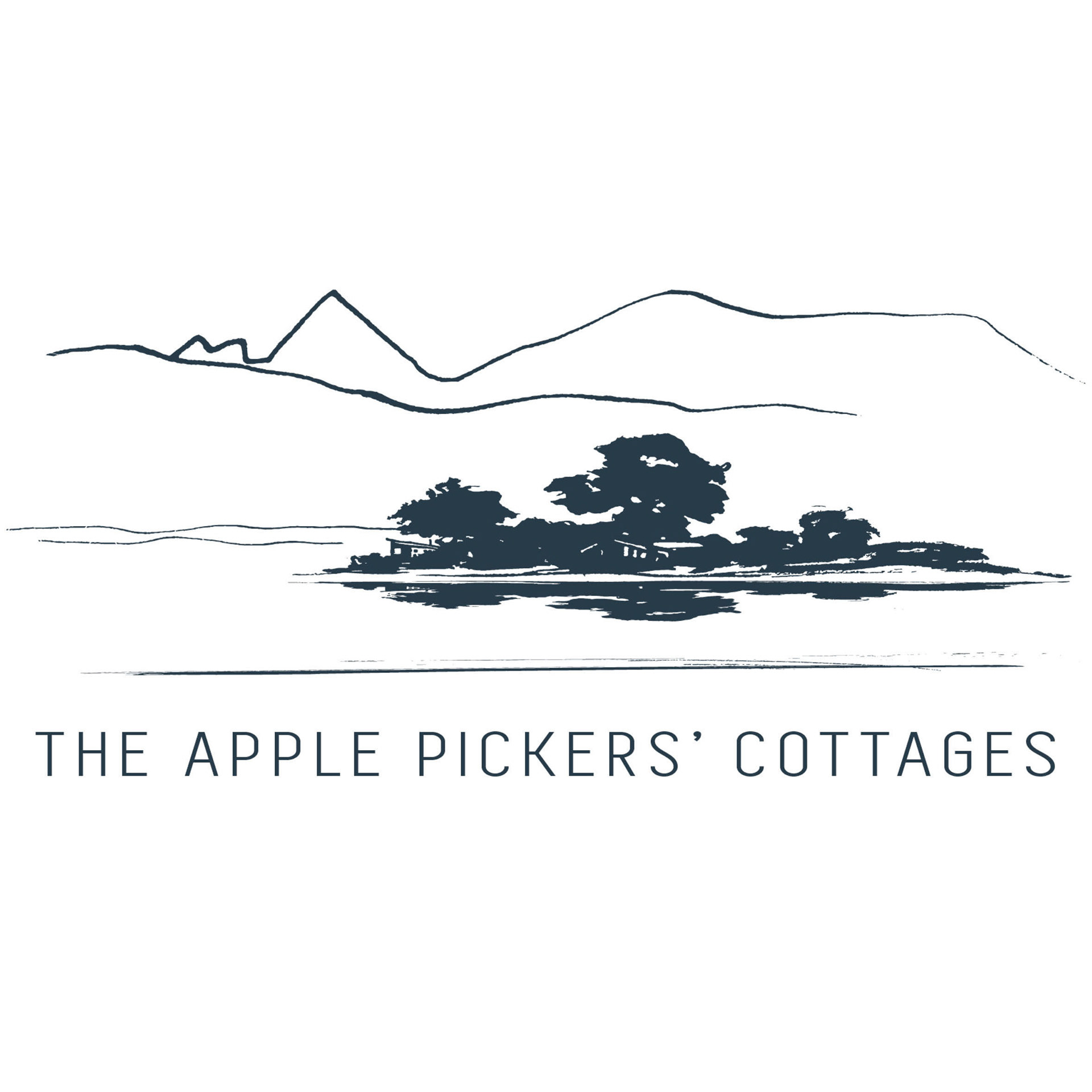
Toss Williston, Rita Angus and Colin McCahon were some of the artists that stayed and painted at the original apple orchard cottages.The first concepts were more expressive and painterly but was adjusted to the clients brief

This logo was done for a person whose moniker is Roman Imps. Minerva seemed to be the perfect representation of her character.

The flax represents Te Pare but can also look like grass and growth

This logo had to sit along the NZFC's logo well. It is mostly used with the gold on black
The journey for the walk is over three days and I wanted to represent each days different characteristic. The shapes represent the flat stones that are found oon much of this coastline

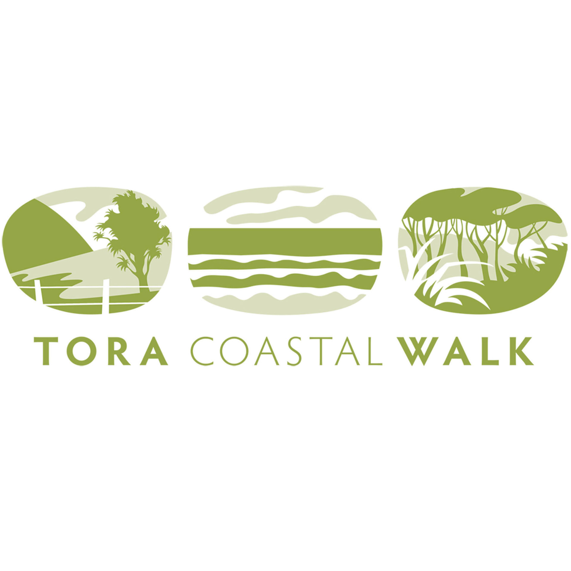
This logo was for a small company that specialised taking up to to 10 passengers from Wellington to the Wairarapa, often to the start of Tora Coastal Walk then picking them up again. They coals also do customised tours with a very flexible timeline, anything from touring vineyards and shops to visiting a dairy farm

This character was developed for Napoli Pizzeria. The owner wanted to base him on Pulcinella

The client wanted something that looked it was from the Pacific and represented growth. They specified the colour

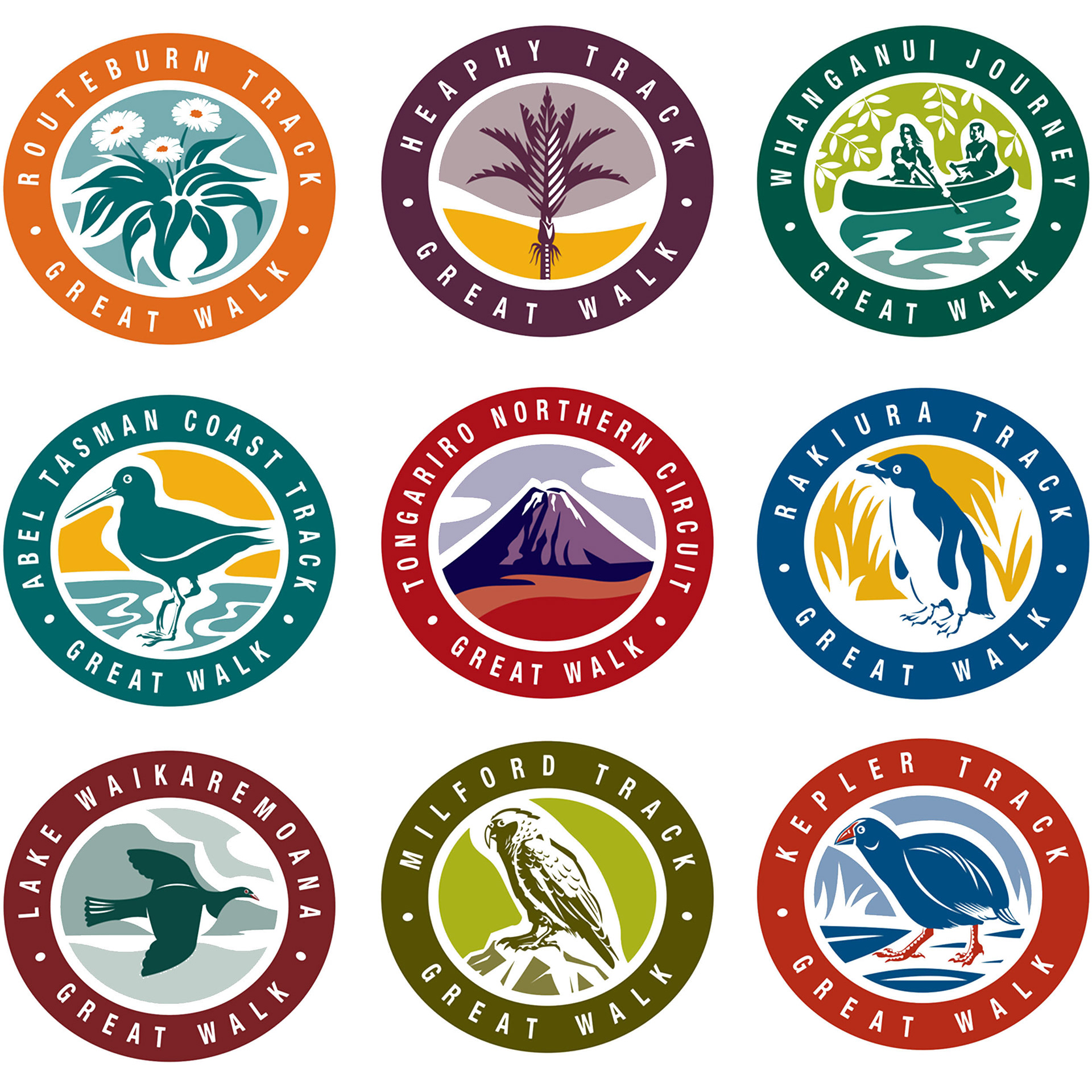
These range of logos were done for DOC but are now no longer in use